9 Cyber Monday Emails that Really Work
It's that time of year again! Black Friday and Cyber Monday are right around the corner. Businesses are trying to figure out how get the most out of...

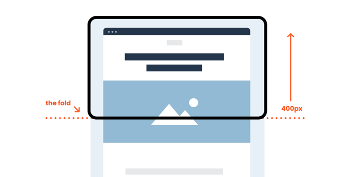
Marketing buzzwords come and go, but some stick around longer than others. One such term is ‘the fold’ in email marketing—that invisible line where content gets cut off unless users decide to scroll. But as we navigate an era of responsive design and diverse devices, it's worth asking: does ‘the fold’ still carry weight today?
In this exploration, we dive into the significance of ‘the fold’ and question whether paying it any mind is a must-do or relic of the past.
The concept of ‘the fold’ originated from the print world, referring to the physical fold in a newspaper that hid part of the page. Back in the day, understanding ‘the fold’ was crucial because content above it was believed to be more visible and, consequently, more engaging.

This idea smoothly transitioned into web design, especially in email marketing, where the top part of an email was considered prime real estate for grabbing attention. In email, the area above the fold is considered to be anywhere from 250 to 400 pixels high. This is the viewable area on most desktop email programs without having to scroll down.

The game changed with the rise of smartphones. Suddenly, everyone was consuming content on screens of all sizes. ‘The fold’ became this elusive, ever-shifting thing that no longer followed a one-size-fits-all rule.

Enter responsive design, and ‘the fold’ took another hit. Websites and emails started adapting to different screen sizes, making the concept of a fixed fold old hat. Content now rearranges itself on the fly, catering to the user's device and preferences. This shift marked a significant departure from the traditional notion of a fixed fold, allowing for a more dynamic and user-centric experience across various devices.
Advocates argue ‘the fold’ is still a big deal in email marketing, especially when it comes to content placed above it. Catchy subject lines, snappy headlines, and eye-catching visuals are seen as essential components to snag attention and encourage immediate engagement. While these things will always be crucial (hint: hire a professional copywriter), their importance is largely independent of ‘the fold.’

On the flip side, mobile has ‘the scroll.’ Apps such as TikTok and Instagram have trained users to scroll constantly. That scrolling behavior applies to web browsing and email as well. When a significant chunk of emails gets opened on mobile devices, obsessing solely over above-the-fold content is shortsighted. Prioritizing mobile-friendly design is the more critical concern. The entire email should be compelling, no matter if the reader scrolls or not. This perspective emphasizes the need for a holistic approach to email design, ensuring that every element is engaging and accessible, irrespective of the user’s scrolling behavior.

Arguably more important than ‘above the scroll’ content is your email’s ‘envelope,’ or the subject line and preheader text (the text that appears after or below the subject line in an inbox). Teasing content in your subject line or preheader that doesn’t appear until after the scroll can build excitement and get the user to scroll and view the entire email.
In our quest to figure out if ‘the fold’ is still a thing in email marketing, it's clear that the consensus has shifted toward: not so much. People today are so used to scrolling after many years of using mobile devices and scroll-based apps that the fold doesn’t really exist anymore. It’s all about the scroll.
While above-the-fold strategies are still crucial for that initial attention grab, acknowledging the importance of the envelope, mobile-friendliness and engaging content across the entire email is non-negotiable. As you adapt to changing priorities, it’s key to stay flexible and challenge old assumptions.
The near future will see a complete departure from fixed folds as technology, user expectations, and design principles continue to evolve. However, some practices remain mandatory. A/B testing, user engagement metrics, and understanding user behavior should always guide your email marketing plan.
Success ultimately lies in understanding your audience, coupled with a willingness to embrace innovation.
Sign up for our monthly newsletter to receive updates.

It's that time of year again! Black Friday and Cyber Monday are right around the corner. Businesses are trying to figure out how get the most out of...
![Home Improvement Marketing: The Value of Video [Statistics]](https://www.mightyroar.com/hubfs/umanoide-8NvFlA8DO6Q-unsplash.jpg)
DIY Home Improvement projects are more accessible than ever, and that accessibility is driven by the most significant change in consumer behavior in...

Email marketing is a challenge, especially in the face of the ongoing competition for your customers' attention from social media, messaging apps,...